- Namecard Design
Client
- SinCo Technologies Pte Ltd
Year
2017
What We Delivered
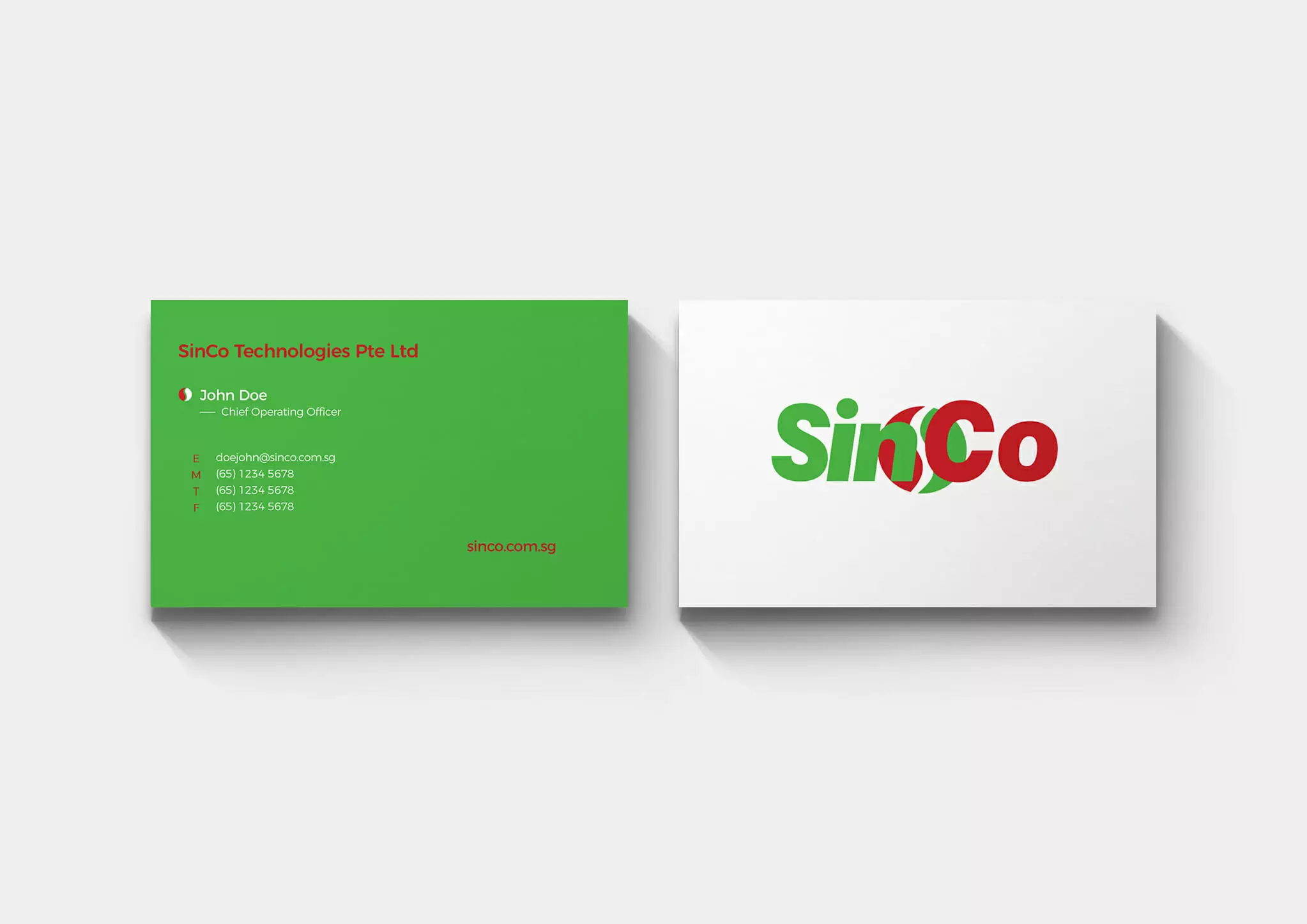
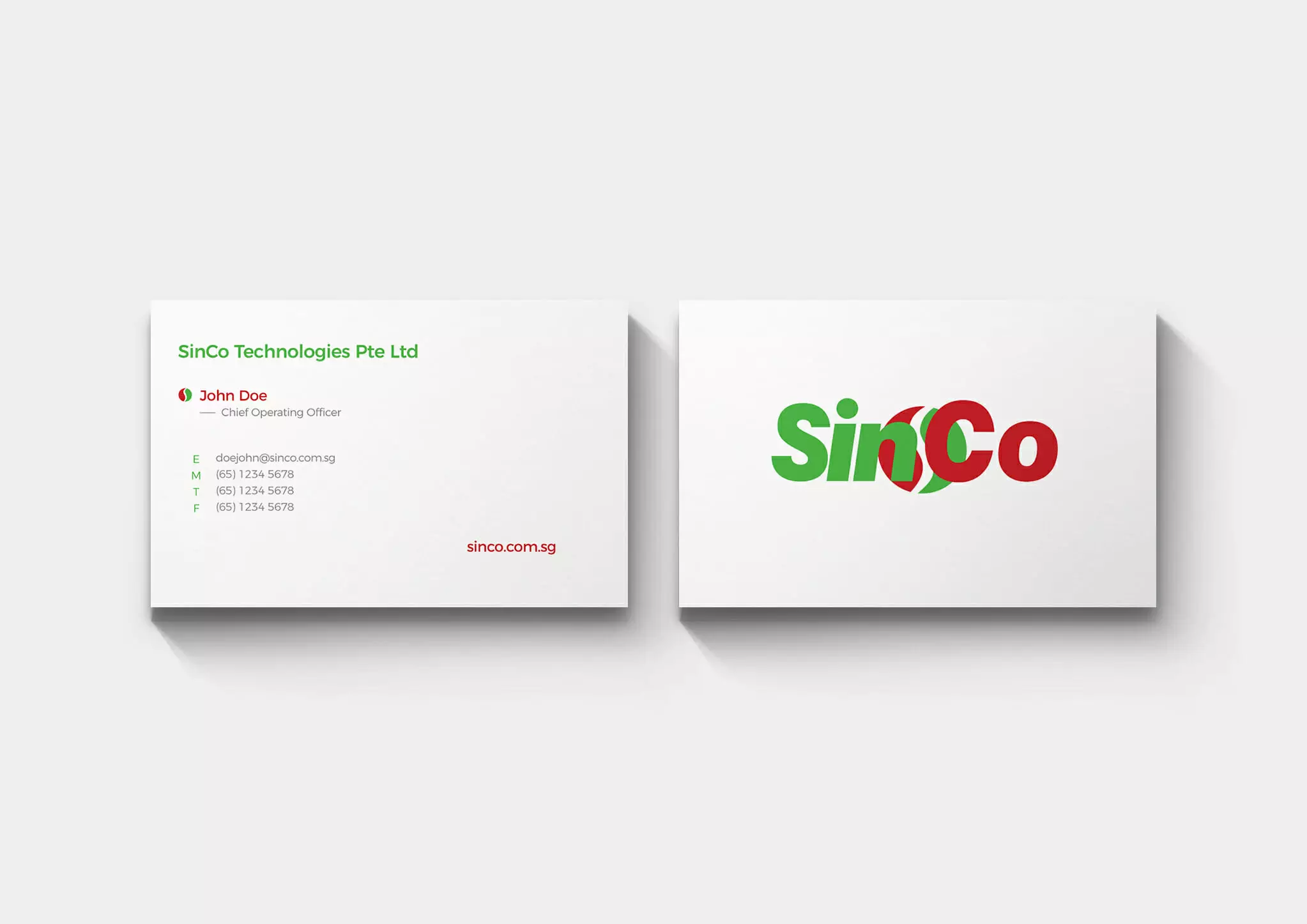
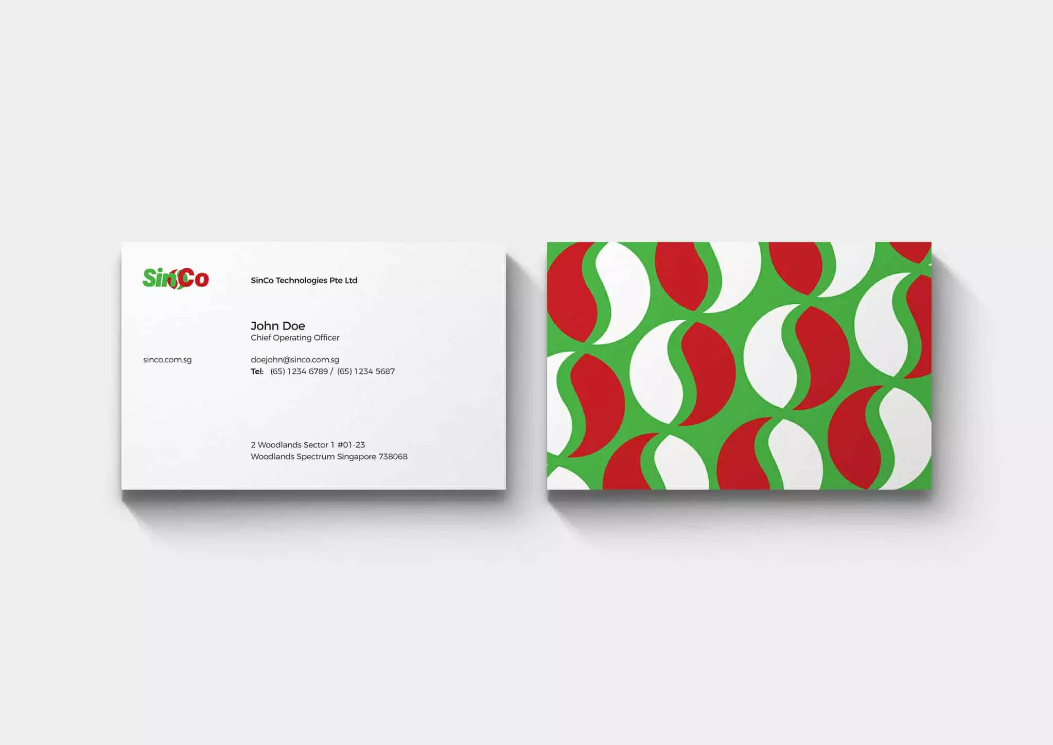
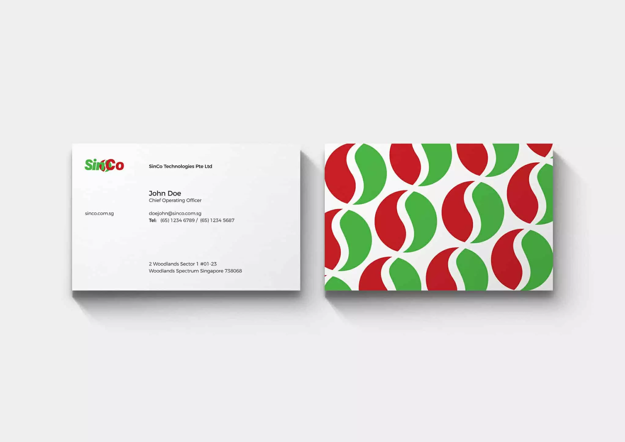
Redesigning the name card of a corporate is often a daunting and interesting challenge as in the essence of branding, the name card design represents the fundamental and visual identity of the multi-national corporate. The design has to be able to clearly convey the company’s qualities, as well as their core services and the genuine connections that the company wants to establish with their targeted audience. We tried several approaches to create a brand new face-lift to the original design of the business card. We stripped off most of the unnecessary information and keeping every essential detail minimalist. We played between the primary colours – Green and Red to strike the audience’s impression using strong contrast in colours. At the same time, the red implies the core services that they are providing in manufacturing, tooling and assembly whilst the green implies the green technology that they have.
Colors & Material
#009d4f
#f4f4f2
#e1251b
Typography
Montserrat
