The mobile era has already started. A tremendous revolution took place in 2015 along with the loud Mobilegeddon. Firstly, Google introduced the mobile-friendly update and actually started to consider mobile an important factor in its search algorithms afterwards. Today, we will speak about a different turnover that is a natural continuation of this trend.
On November 4th last year, Google Webmaster Central Blog released a blog post about the experiments with mobile-first indexing that will be brought out gradually and pushed from a small to larger scale. And this is going to be a global rollout.
Googlers justify the necessary shift with the fact that over 60% of the people actually browse Google using mobile devices, so naturally the shift is inevitable. As of now, Google’s main index is currently based on a desktop version of a page’s content.
While content relevancy is the highest priority for this search engine, desktop-based indexing can be the cause of issues (as in the case of condemned content). Mobile versions of sites are more neglected nowadays than desktop versions; perhaps this switch will convince site owners to enhance them. is Which is why Google even moved the whole page speed insights to the mobile-friendly test tool.
What’s more, Google has revealed that it’s eventually going to permanently use the mobile version of content as a base index.
So we’ve got one major piece of SEO advice for all the SEOs out there → Consider your mobile and desktop website with the same level of importance.
The Alleged Search Index Split
So Google will eventually crawl and index mobile content as a primary source to its search algorithm.
In November’s blog post, Google stated that they were going to keep one single index of websites and apps; however, this created some confusion as some authority sources previously stated that Google was Splitting its Search Index.

The premise that two separate indexes would be created had spread; the first would be a mobile index – the privileged one – and the second would be a desktop index. However, those rumors were later dispelled. Now the situation is clear: many experiments will take place, and some of them may also include separate.
Now the situation is clear: many experiments will take place, and some of them may also include separate indexing, but the single index is here to stay.
When will mobile-first indexing be live?
To some extent, it’s already live. As of now, it’s in the experimental phase which includes a limited group of users, and this group will be expanded when Google is confident it has achieved a great user experience. Nevertheless, mobile-first indexing will replace desktop-based indexing in 2017.
What can we expect from this change?
This change will affect the rankings of websites that have never provided users with a flawless mobile experience. So if you have a responsive website and you provide the same design, structure, and content which adjusts to different screen sizes and devices appropriately, you don’t need to worry.
Googlers do admit that they will preserve the desktop version for websites that don’t have mobile versions, but stating that the mobile search is only for the millennials can’t serve as an excuse any longer; you have to make Mobile SEO your priority.
Invest in Mobile SEO now
Check how your website looks on a mobile screen directly from your smartphone, or view the mobile version of your site on the desktop by clicking on your left touchpad button and choosing “inspect and toggle” between desktop and mobile.
Basic Mobile SEO Tips for your Website
1. Conduct a mobile-friendly test.
The first tip is to check if and how friendly your mobile website is. Remember that each page of your site should be tested separately. It’s not enough to only test your homepage and be glad it passed. Test all of your pages as your score can differ between each. It may take some time, but it’s better to check everything now than realize one day that some pages are pulling your SEO results down.
Start with key money and navigation pages as they are used most frequently by your visitors.
2. Is your mobile version indexed correctly?
Double check if the mobile version of your website is properly indexed. To proceed, go to a browser on your smartphone and type in site:yourdomain.com. If you see results, it means that everything is correct, and if not, you have an issue or two to fix.
One of the reasons your mobile results may not have been indexed correctly might have something to do with having different URLs for your desktop and mobile website. If that’s the case, it’s necessary to add a sitemap to your mobile site and also tag all your mobile URLs with canonical and alternate tags. Then submit a mobile sitemap to Google Search Console, and add it to your robot.txt file.
If that doesn’t fix the problem, the issue may be due to a robot.txt configuration – check that you aren’t blocking the robots from crawling.
3. Check Google Search Console
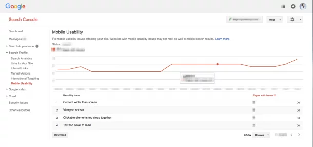
Another basic tip is to go to the Google Search Console dashboard then → Search Traffic and → Mobile Usability. This section will tell you everything you need to know about “mobile usability issues affecting your site.”
You will see a graph with your mobile usability status vs. time. Below you will find a report with the total number of mobile issues, information about each and a list of pages that indicate the specific problems.

Issues can refer to:
- Viewport not set
- Clickable elements too close together
- Content that’s wider than the screen
- Text too small to read
Depending on the issue, an appropriate improvement should be implemented.
There is also another section in Google Search Console you should be using to check for mobile-friendliness. From Google Search Console go to → Crawl and then → Crawl Errors, which is the first tab.
You’ll be able to see all the crawl errors within your website on desktop and mobile devices. Check errors that occurred only when your mobile site was crawled by Googlebot because these errors don’t appear on the desktop.
Here you’ll also find a chart presenting the number of crawling errors and a report below telling you what kind of errors you have to deal with and what pages they refer to.
Install correct redirects on all the error pages, and then clean up the report.
4. Your mobile content should be equal to the desktop content
This part will demand that you collaborate with your editorial team and devs. Conduct an audit by comparing each URL on the desktop and mobile. If you see any differences regarding content and design, note them down, and ask your editors to make the necessary adjustments, or request the designers and devs to improve the mobile structure and perform a redesign.
5. Optimize your site speed
The speed of your website, and especially the mobile site, should be skyrocketing. We recently published an article about the Google Accelerated Mobile Project which states that Google AMP is The Future of Mobile Content🚀 and this is still very much the case. Since we don’t recommend you convert your website to AMP (it has its dark sides), we strongly advise you to make your mobile and desktop site as fast as the AMP is.
Run this page speed test, and see if there are any issues with the load time of any one of your pages. Your score and issues will differ between each, so it’s important to check all the pages of your site and implement improvements based on the suggestions. Since this may be time-consuming, get a dev to help you. And remember: in the era of AMP ( favored by Google) maintaining a competitive speed is vital.
6. Optimize for mobile keywords
Searchers on mobile are slightly different than on desktop. You could read about it in this article – Search Marketing Trends in 2017: The 3 Big Innovations – which I recently wrote for Weebly.
On mobile, voice search already makes up around 20% of all searches, so the style of queries is slightly different than it is on the desktop. Namely, people get more personal and express their queries in a conversational manner. Also, searchers usually have slightly different – more urgent – objectives when they browse on mobile: in other words, real-time, intent-driven micro-moments.
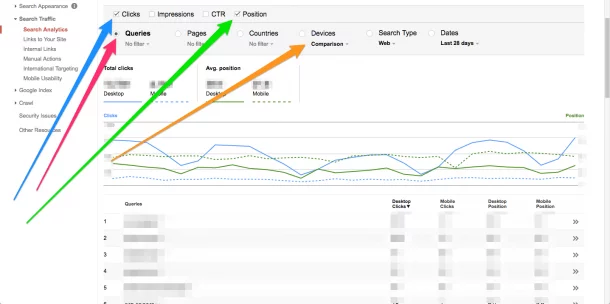
If you want to view mobile queries relevant to your business, go into your Google Search Console → Search Traffic → Search Analytics → and see the report for queries, clicks, positions and comparison between devices mobile to the desktop:

You can also see and compare how many desktop vs. mobile impressions have been collected for each phrase.
How many desktop vs. mobile impressions have been collected for each phrase
This report is ideal for you because it lets you see the differences in organic traffic across devices and helps you discover new mobile keywords that are already bringing you some traffic. You can use the information you gain from the report for future optimizations.
Within this report, you can also see keywords for which you rank much better on mobile than on desktop. And this is valuable knowledge for you.
All in all, this is a fantastic resource for you to base your keywords strategy on. Download mobile keywords and add it to your Positionly account to monitor their performance over time.
7. Take care of your local SEO
“Near me” searches are on the rise” – Mobile SEO is increasingly becoming more focused on local search, and this is because user intent has recently become an important factor for Google. The majority of mobile queries, nearly 80%, relate to things which are in the direct neighborhood of the searcher.
This makes local SEO optimization vital for your mobile success. What elements should be cared for?
- Google My Business – If you don’t have it yet, it is the right time to sign-up and makes your GMB profile. So register, create a high quality, precise description of your service and products, add as many high-res images that align with your brand identity as you can. Select accurate categories, link to your website, add social accounts and make sure that all the data (like a phone number) is up to date.
- Local Reviews – They seem to be the strongest signal to Google’s local search algorithm. Work on acquiring positive reviews. Learn how to initiate them after an interaction with a happy customer, and discover the most relevant tactics for your niche. And never leave a review (mainly negative) without a reply; be helpful and try to relieve any tension.
- Consistent NAP = Have the same name, address and phone number on your website and listings. Have this necessary information up to date, especially on the mobile version of your site. There is nothing worse e.g. for a pizza place to have the wrong number listed on GMB. That’s a definite deal breaker.
- Schema Markup – Microdata adds additional elements to your listings that help you stand out, tell more about you just from a search result page and drive attention.
These items will bring you more clicks and lift your rankings up. Schema.org has various categories for a local business including the hours open, price range, accepted payment types, and many other attributes which will enrich your profile and set you apart.
Mobile Penalty
It’s official; Google is rolling out the mobile penalty. Google’s Gary Illyes and John Mueller both confirmed this information on the 11th of January. However, as of now, the penalty will only impact “interstitials that are present when someone clicks from Google’s mobile search to your web page.” These include:
- pop-ups that cover the whole mobile screen immediately after a user lands on a page;
- pages above the fold design that resembles an advertisement, so a user needs to scroll down to skip it
- standalone interstitials that users need to jump before accessing the intended content. Annoying they all are indeed, aren’t they?
Wrapping Up
As can be concluded after reading this piece, mobile SEO is a big topic this year. All you have to do is to follow my advice to keep up with trends.
How do you like my article? Would you like to add or discuss anything? Feel free to tell me in the comments below.
Reference – Positionly Blog

